SharePoint Framework & Angular Elements : Building your first Web Part


Now that you are excited by the introduction of Angular Elements, a Google technology that enables us, Enterprise Developers, to use Angular as a Development tool rather than a full blown framework, how cool would it be to start using it TODAY, using its current alpha/beta release? Well, you’re at the right place!
Angular Elements and SharePoint Framework are still in their developments. This codes is based on pre-release of Angular Elements and a very “rough” integration with the SharePoint Framework. I am still pushing those samples so you can start playing with the technology. Please don’t use any of this in production as of today. I will update the posts and code when better support will be offered by both Angular and SharePoint Framework.
This post is part of a series of post on integrating the SharePoint Framework with Angular Elements
- SharePoint Framework & Angular Elements : Building your first Web Part (this post)
- SharePoint Framework & Angular Elements : Connecting to your SharePoint data
- SharePoint Framework & Angular Elements : Mocking your data
- SharePoint Framework & Angular Elements : Using Google Material Design
- SharePoint Framework & Angular Elements : Using Office UI Fabric Core
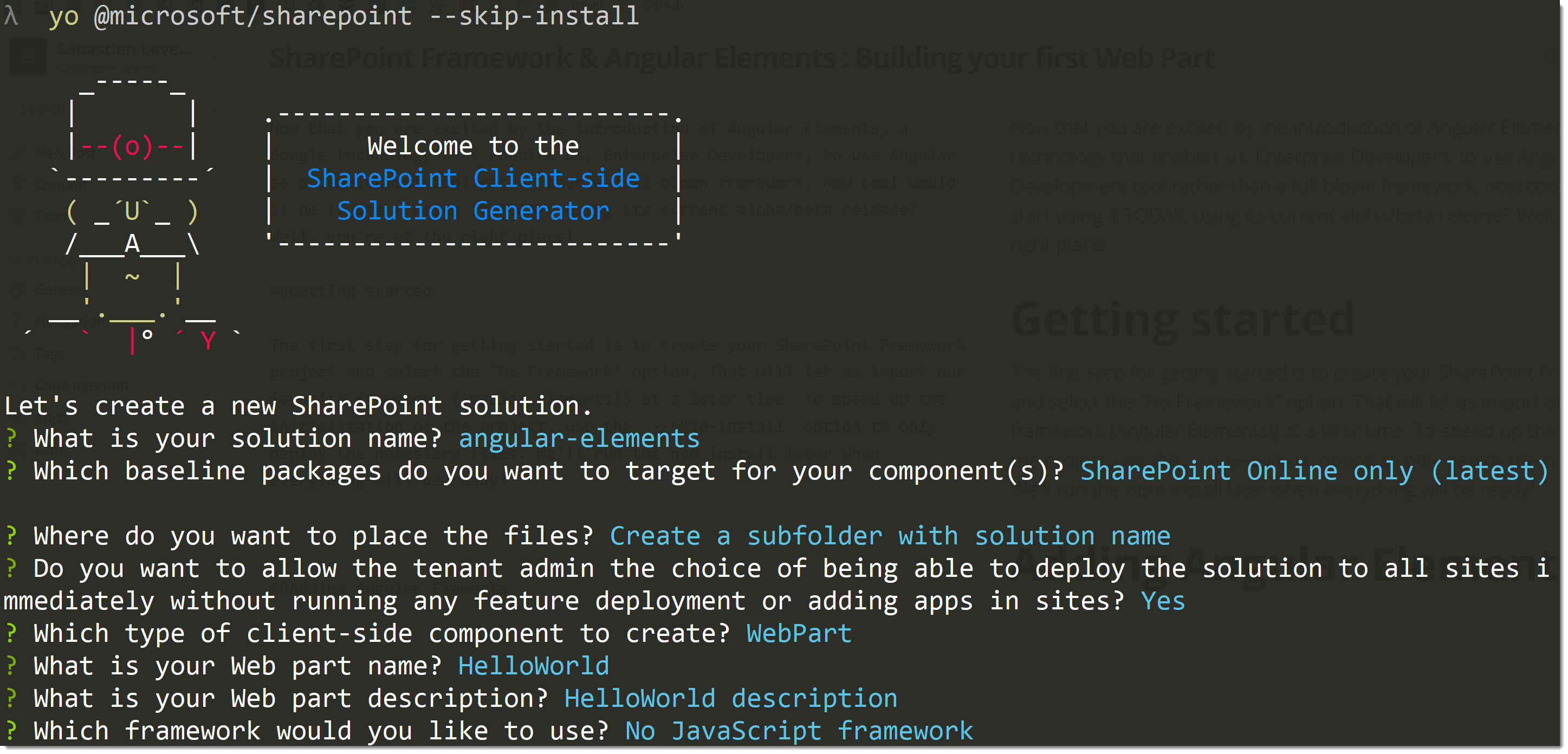
Getting started
The first step for getting started is to create your SharePoint Framework project and select the “No Framework” option.
That will let us import our favorite framework (Angular Elements!) at a later time. To speed up the initialization of
the project, use the --skip-install option to only deploy the necessary files. We’ll run the npm install later when
everything will be ready!
Adding Angular Elements
Your project is now ready for Angular! How do we add Angular and Angular Elements to the mix? Well, it’s pretty simple,
thanks to their npm packages! Use the following package.json to make sure you get the proper dependencies and
references in your project.
{
  "name": "spfx-ng-webparts",
  "version": "0.0.1",
  "private": true,
  "engines": {
    "node": ">=0.10.0"
  },
  "scripts": {
    "build": "gulp bundle",
    "clean": "gulp clean",
    "test": "gulp test"
  },
  "dependencies": {
    "@angular/animations": "angular/animations-builds",
    "@angular/common": "angular/common-builds",
    "@angular/compiler": "angular/compiler-builds",
    "@angular/compiler-cli": "angular/compiler-cli-builds",
    "@angular/core": "angular/core-builds",
    "@angular/elements": "angular/elements-builds#labs/elements",
    "@angular/platform-browser": "angular/platform-browser-builds",
    "@angular/platform-browser-dynamic": "angular/platform-browser-dynamic-builds",
    "@angular/platform-server": "angular/platform-server-builds",
    "@microsoft/sp-core-library": "~1.3.4",
    "@microsoft/sp-lodash-subset": "~1.3.4",
    "@microsoft/sp-office-ui-fabric-core": "~1.3.4",
    "@microsoft/sp-webpart-base": "~1.3.4",
    "@ngtools/webpack": "^1.8.0",
    "@types/webpack-env": ">=1.12.1 <1.14.0",
    "rxjs": "^5.5.2"
  },
  "devDependencies": {
    "@microsoft/sp-build-web": "~1.3.4",
    "@microsoft/sp-module-interfaces": "~1.3.4",
    "@microsoft/sp-webpart-workbench": "~1.3.4",
    "@types/chai": ">=3.4.34 <3.6.0",
    "@types/mocha": ">=2.2.33 <2.6.0",
    "ajv": "~5.2.2",
    "enhanced-resolve": "3.4.1",
    "exports-loader": "^0.6.4",
    "gulp": "~3.9.1",
    "uglify-es": "^3.2.0",
    "raw-loader": "^0.5.1",
    "sass-loader": "^6.0.6",
    "style-loader": "^0.19.0",
    "uglifyjs-webpack-plugin": "^1.1.1",
    "webpack-bundle-analyzer": "^2.9.1",
    "webpack-merge": "^4.1.1"
  }
}
##Modifying your build process To enable Angular Elements (and AOT compilation) in your project, you have to make some
changes to your TypeScript and your build configurations. The following files should replace your tsconfig.json and
gulpfile.js files! This will enable your solution to transpile your TypeScript to ES2015 and will ask Angular to
take care of the JS/TS packaging.
{
  "compilerOptions": {
    "target": "es2015",
    "forceConsistentCasingInFileNames": true,
    "module": "commonjs",
    "jsx": "react",
    "declaration": true,
    "sourceMap": true,
    "skipLibCheck": true,
    "experimentalDecorators": true,
    "emitDecoratorMetadata": true,
    "types": ["webpack-env"],
    "lib": ["dom", "es2015"]
  }
}
'use strict';

const gulp = require('gulp');
const path = require('path');
const build = require('@microsoft/sp-build-web');
const merge = require('webpack-merge');
const { AngularCompilerPlugin } = require('@ngtools/webpack');
const webpack = require('webpack');
const UglifyJSPlugin = require('uglifyjs-webpack-plugin');

build.configureWebpack.mergeConfig({
  additionalConfiguration: (generatedConfiguration) => {
    if (build.configureWebpack.buildConfig.production) {
      generatedConfiguration.plugins.forEach((plugin) => {
        if (plugin instanceof webpack.optimize.UglifyJsPlugin) {
          var index = generatedConfiguration.plugins.indexOf(plugin);
          generatedConfiguration.plugins.splice(index, 1);
        }
      });

      generatedConfiguration.plugins.push(new UglifyJSPlugin());
    }

    Object.assign(generatedConfiguration.resolve, { extensions: ['.ts', '.js'] });
    generatedConfiguration.module.rules = [
      { test: /\.ts$/, loader: '@ngtools/webpack' },
      {
        test: /\.scss$/,
        use: ['raw-loader', 'sass-loader'],
      },
      {
        test: /\.css$/,
        loader: ['raw-loader', 'css-loader'],
      },
      { test: /\.html$/, loader: 'raw-loader' },
    ];

    generatedConfiguration.plugins.push(
      new AngularCompilerPlugin({
        tsConfigPath: path.resolve('./tsconfig.json'),
        entryModule: path.resolve('src/elements/elements') + '#NgElementDemos',
      })
    );

    return generatedConfiguration;
  },
});

build.typescript.enabled = false;
build.tslint.enabled = false;

build.initialize(gulp);
Add the Angular Elements plumbing
To use the magic provided by Angular Elements, it’s important to lay out some foudations for any of your Web Parts that live in that solution. Because Angular Elements leverages the Web Components proposed standard, it’s important to “shim” it in case the browser used does not work already with Web Components (I’m looking at you, Edge…) and also to build the basic Module that will take care of embedding you Angular components within that Web Component.
import { NgModule } from '@angular/core';

@NgModule({})
export class ElementsModule {}
import 'zone.js';

(function () {
  'use strict';

  if (window['WC_SHIMMED']) return;

  (() => {
    'use strict';
    if (!window.customElements) return;
    const a = window.HTMLElement,
      b = window.customElements.define,
      c = window.customElements.get,
      d = new Map(),
      e = new Map();
    let f = !1,
      g = !1;
    (window.HTMLElement = function () {
      if (!f) {
        const a = d.get(this.constructor),
          b = c.call(window.customElements, a);
        g = !0;
        const e = new b();
        return e;
      }
      f = !1;
    }),
      (window.HTMLElement.prototype = a.prototype);
    Object.defineProperty(window, 'customElements', { value: window.customElements, configurable: !0, writable: !0 }),
      Object.defineProperty(window.customElements, 'define', {
        value: (c, h) => {
          const i = h.prototype,
            j = class extends a {
              constructor() {
                super(), Object.setPrototypeOf(this, i), g || ((f = !0), h.call(this)), (g = !1);
              }
            },
            k = j.prototype;
          (j.observedAttributes = h.observedAttributes),
            (k.connectedCallback = i.connectedCallback),
            (k.disconnectedCallback = i.disconnectedCallback),
            (k.attributeChangedCallback = i.attributeChangedCallback),
            (k.adoptedCallback = i.adoptedCallback),
            d.set(h, c),
            e.set(c, h),
            b.call(window.customElements, c, j);
        },
        configurable: !0,
        writable: !0,
      }),
      Object.defineProperty(window.customElements, 'get', { value: (a) => e.get(a), configurable: !0, writable: !0 });
  })();

  /**
  @license
  Copyright (c) 2017 The Polymer Project Authors. All rights reserved.
  This code may only be used under the BSD style license found at http://polymer.github.io/LICENSE.txt
  The complete set of authors may be found at http://polymer.github.io/AUTHORS.txt
  The complete set of contributors may be found at http://polymer.github.io/CONTRIBUTORS.txt
  Code distributed by Google as part of the polymer project is also
  subject to an additional IP rights grant found at http://polymer.github.io/PATENTS.txt
  */
  window['WC_SHIMMED'] = true;
})();
Building your Angular Component
Then, it’s time for the actual work to happen. You need to create your Angular component using regular Angular code and you will want to tie it to you SharePoint Framework Web Part.
The necessary files for the component to work are its logic, its template and its styles files. Then, those files will be all mixed together and exported as a self-bootstrapped Web Component.
hello-world.ts
import { Component, NgModule, Input, ViewEncapsulation } from '@angular/core';
import { BrowserModule } from '@angular/platform-browser';
import { CommonModule } from '@angular/common';

@Component({
  selector: 'hello-world',
  templateUrl: `./hello-world.html`,
  styleUrls: ['hello-world.scss'],
  encapsulation: ViewEncapsulation.None,
})
export class HelloWorld {
  @Input() description: string;
}

@NgModule({
  imports: [BrowserModule],
  declarations: [HelloWorld],
  entryComponents: [HelloWorld],
})
export class HelloWorldModule {
  ngDoBootstrap() {}
}
hello-world.html
<div class="helloWorld">
  <div class="container">
    <div class="row">
      <div class="column">
        <span class="title">Welcome to SharePoint!</span>
        <p class="subTitle">Customize SharePoint experiences using Web Parts.</p>
        <p class="description">{{ description }}</p>
        <a href="https://aka.ms/spfx" class="button">
          <span class="label">Learn more</span>
        </a>
      </div>
    </div>
  </div>
</div>
styles.scss
@import 'node_modules/@microsoft/sp-office-ui-fabric-core/dist/sass/SPFabricCore.scss';

.helloWorld {
  .container {
    max-width: 700px;
    margin: 0px auto;
    box-shadow: 0 2px 4px 0 rgba(0, 0, 0, 0.2), 0 25px 50px 0 rgba(0, 0, 0, 0.1);
  }

  .row {
    @include ms-Grid-row;
    @include ms-fontColor-white;
    background-color: $ms-color-themeDark;
    padding: 20px;
  }

  .column {
    @include ms-Grid-col;
    @include ms-lg10;
    @include ms-xl8;
    @include ms-xlPush2;
    @include ms-lgPush1;
  }

  .title {
    @include ms-font-xl;
    @include ms-fontColor-white;
  }

  .subTitle {
    @include ms-font-l;
    @include ms-fontColor-white;
  }

  .description {
    @include ms-font-l;
    @include ms-fontColor-white;
  }

  .button {
    // Our button
    text-decoration: none;
    height: 32px;

    // Primary Button
    min-width: 80px;
    background-color: $ms-color-themePrimary;
    border-color: $ms-color-themePrimary;
    color: $ms-color-white;

    // Basic Button
    outline: transparent;
    position: relative;
    font-family: 'Segoe UI WestEuropean', 'Segoe UI', -apple-system, BlinkMacSystemFont, Roboto, 'Helvetica Neue', sans-serif;
    -webkit-font-smoothing: antialiased;
    font-size: $ms-font-size-m;
    font-weight: $ms-font-weight-regular;
    border-width: 0;
    text-align: center;
    cursor: pointer;
    display: inline-block;
    padding: 0 16px;

    .label {
      font-weight: $ms-font-weight-semibold;
      font-size: $ms-font-size-m;
      height: 32px;
      line-height: 32px;
      margin: 0 4px;
      vertical-align: top;
      display: inline-block;
    }
  }
}
index.ts
//web components ES5 shim
import '../../../elements/wc-shim';
import { registerAsCustomElements } from '@angular/elements';
import { platformBrowser } from '@angular/platform-browser';

import { HelloWorld, HelloWorldModule } from './hello-world';
import { HelloWorldModuleNgFactory } from './hello-world.ngfactory';

registerAsCustomElements([HelloWorld], () =>
  platformBrowser().bootstrapModuleFactory(HelloWorldModuleNgFactory)
).catch((err) => console.log(err));
Configuring your WebPart
It’s now the time inject that component in your SharePoint Framework Web Part. Using the HelloWorld class will make it
available and will also act as your this.properties bag. Very clever and simple to use. You have to note 2 things. The
usage of HelloWorld as the Properties type passed in the class declaration and the render method that simply embeds the
custom element and passes in the name properties!
HelloWorldWebPart.ts
import './elements';
import { HelloWorld } from './elements/hello-world';
import { NgElement } from '@angular/elements';

import { Version } from '@microsoft/sp-core-library';
import { BaseClientSideWebPart, IPropertyPaneConfiguration, PropertyPaneTextField } from '@microsoft/sp-webpart-base';

export default class HelloWorldWebPartWebPart extends BaseClientSideWebPart<HelloWorld> {
  constructor() {
    super();
  }

  public render(): void {
    this.domElement.innerHTML = `
      <hello-world
        name="${this.properties.name}">
      </hello-world>`;
  }

  protected get dataVersion(): Version {
    return Version.parse('1.0');
  }

  protected getPropertyPaneConfiguration(): IPropertyPaneConfiguration {
    return {
      pages: [
        {
          header: {
            description: 'Hello World Configuration',
          },
          groups: [
            {
              groupName: 'Options',
              groupFields: [
                PropertyPaneTextField('name', {
                  label: 'Name',
                }),
              ],
            },
          ],
        },
      ],
    };
  }
}
You will also have to make some light changes to your config.json file to indicate to Angular your new entry points
and to specify your Module.
config.json
{
  "$schema": "https://dev.office.com/json-schemas/spfx-build/config.2.0.schema.json",
  "version": "2.0",
  "bundles": {
    "hello-world-web-part": {
      "components": [
        {
          "entrypoint": "./src/webparts/helloWorld/HelloWorldWebPart.ts",
          "manifest": "./src/webparts/helloWorld/HelloWorldWebPart.manifest.json",
          "entryModule": "./src/webparts/helloWorld/elements/hello-world",
          "entryModuleName": "HelloWorldModule"
        }
      ]
    }
  },
  "externals": {},
  "localizedResources": {}
}
Run your webpart
Once your Web Part is ready, you can finally run it using gulp serve and see the result directly in your SharePoint
Workbench!
Enjoy!
Now that your webpart works, I’ll let you play around and explore the joys of the SharePoint Framework with Angular Elements!


