SharePoint Framework & Angular Elements : Using Google Material Design

One of the great feature of Angular is the easiness to use third party libraries. There are tons of open source libraries that can make you more productive while you are writing your code. On of my favorite (especially because I simple can’t make things pretty) is Angular Material, the Angular implementation of Google Material Design. And even better, it fits nicely with Angular Elements withing your SharePoint Framework webparts!
Angular Elements and SharePoint Framework are still in their developments. This codes is based on pre-release of Angular Elements and a very “rough” integration with the SharePoint Framework. I am still pushing those samples so you can start playing with the technology. Please don’t use any of this in production as of today. I will update the posts and code when better support will be offered by both Angular and SharePoint Framework.
This post is part of a series of post on integrating the SharePoint Framework with Angular Elements
- SharePoint Framework & Angular Elements : Building your first Web Part
- SharePoint Framework & Angular Elements : Connecting to your SharePoint data
- SharePoint Framework & Angular Elements : Mocking your data
- SharePoint Framework & Angular Elements : Using Google Material Design (this post)
- SharePoint Framework & Angular Elements : Using Office UI Fabric Core
Add the reference to Angular Material
First step in getting things ready for Google Material is to simply add the packages to your dependencies section of
your packages.json so you can refer to the Angular Material packages inside your code. There are 2 new packages to
reference :
"@angular/cdk": "^5.0.0-rc.2""@angular/material": "^5.0.0-rc.2"
{
  "name": "spfx-ng-webparts",
  "version": "0.0.1",
  "private": true,
  "engines": {
    "node": ">=0.10.0"
  },
  "scripts": {
    "build": "gulp bundle",
    "clean": "gulp clean",
    "test": "gulp test"
  },
  "dependencies": {
    "@angular/animations": "angular/animations-builds",
    "@angular/cdk": "^5.0.0-rc.2",
    "@angular/common": "angular/common-builds",
    "@angular/compiler": "angular/compiler-builds",
    "@angular/compiler-cli": "angular/compiler-cli-builds",
    "@angular/core": "angular/core-builds",
    "@angular/elements": "angular/elements-builds#labs/elements",
    "@angular/forms": "angular/forms-builds",
    "@angular/material": "^5.0.0-rc.2",
    "@angular/platform-browser": "angular/platform-browser-builds",
    "@angular/platform-browser-dynamic": "angular/platform-browser-dynamic-builds",
    "@angular/platform-server": "angular/platform-server-builds",
    "@microsoft/sp-core-library": "~1.3.4",
    "@microsoft/sp-lodash-subset": "~1.3.4",
    "@microsoft/sp-office-ui-fabric-core": "~1.3.4",
    "@microsoft/sp-webpart-base": "~1.3.4",
    "@ngtools/webpack": "^1.8.0",
    "@pnp/spfx-property-controls": "^1.0.0",
    "@types/webpack-env": ">=1.12.1 <1.14.0",
    "chance": "^1.0.12",
    "lodash": "^4.17.4",
    "rxjs": "^5.5.2",
    "sp-pnp-js": "^3.0.2",
    "zone.js": "0.8.18"
  },
  "devDependencies": {
    "@microsoft/sp-build-web": "~1.3.4",
    "@microsoft/sp-module-interfaces": "~1.3.4",
    "@microsoft/sp-webpart-workbench": "~1.3.4",
    "@types/chai": ">=3.4.34 <3.6.0",
    "@types/mocha": ">=2.2.33 <2.6.0",
    "ajv": "~5.2.2",
    "enhanced-resolve": "3.4.1",
    "exports-loader": "^0.6.4",
    "gulp": "~3.9.1",
    "raw-loader": "^0.5.1",
    "sass-loader": "^6.0.6",
    "style-loader": "^0.19.0",
    "uglify-es": "^3.2.0",
    "uglifyjs-webpack-plugin": "^1.1.1",
    "webpack-bundle-analyzer": "^2.9.1",
    "webpack-merge": "^4.1.1"
  }
}
The only missing piece now is to install them in your node_modules folder. So go for it, run npm install!
Those 2 packages will add all the features you need within your application and you will be able to use a ton of the controls and components provided by the Material team.
Using Angular Material in your Component
Here, the only code you will have to run is 100% Angular and has nothing to do with the SharePoint Framework! First, you
will have to use the mat-* components in your templates to refer to the Angular Material components.
<div class="example-container mat-elevation-z8">
  <mat-toolbar color="primary">
    <mat-toolbar-row>
      <span>{{ name }}</span>
    </mat-toolbar-row>
  </mat-toolbar>
</div>
Then you will want to use the regular Material Designs themes in your SharePoint Framework components. How to do that? Using SCSS, you will be able to refer the Theming methods of Angular Material and build your own theme! Here’s the theme I’m using that is mainly the blue / indigo version of Material Design!
/* fallback */
@font-face {
  font-family: 'Material Icons';
  font-style: normal;
  font-weight: 400;
  src: local('Material Icons'), local('MaterialIcons-Regular'),
    url(https://fonts.gstatic.com/s/materialicons/v17/2fcrYFNaTjcS6g4U3t-Y5ZjZjT5FdEJ140U2DJYC3mY.woff2) format('woff2');
}

.material-icons {
  font-family: 'Material Icons';
  font-weight: normal;
  font-style: normal;
  font-size: 24px;
  line-height: 1;
  letter-spacing: normal;
  text-transform: none;
  display: inline-block;
  white-space: nowrap;
  word-wrap: normal;
  direction: ltr;
  -webkit-font-feature-settings: 'liga';
  -webkit-font-smoothing: antialiased;
}

@import '~@angular/material/theming';

// Include non-theme styles for core.
@include mat-core();

// Define a theme.
$primary: mat-palette($mat-indigo);
$accent: mat-palette($mat-pink, A200, A100, A400);

$theme: mat-light-theme($primary, $accent);

// Include all theme styles for the components.
@include angular-material-theme($theme);

.example-container {
  display: flex;
  flex-direction: column;
  min-width: 300px;
}

.example-header {
  min-height: 64px;
  padding: 8px 24px 0;
}

.mat-form-field {
  font-size: 14px;
  width: 100%;
}

.mat-table {
  overflow: auto;
  max-height: 500px;
}
The only missing piece is to make sure that your Angular component glues everything together!
import { Component, Input, ViewEncapsulation } from '@angular/core';

@Component({
  selector: 'angular-material',
  templateUrl: 'angular-material.html',
  styleUrls: ['angular-material.scss'],
  encapsulation: ViewEncapsulation.None,
})
export class AngularMaterial {
  @Input() public name: string;
}
Referencing Angular Material in your Module
All that automatic loading is all possible because of the Angular Module that instructs the bundler which packages to
load at the bundle time. In our case, we are only using the MatToolbarModule but we would add all the different
modules we are using in your Angular Module. Go on the Angular Material to view all the
APIs examples to know which module to load when!
import { AngularMaterial } from './angular-material';
import { NgModule } from '@angular/core';
import { MatToolbarModule } from '@angular/material';
import { BrowserModule } from '@angular/platform-browser';
import { CommonModule } from '@angular/common';
import { BrowserAnimationsModule } from '@angular/platform-browser/animations';
import { Environment, EnvironmentType } from '@microsoft/sp-core-library';

/**
 * Module that intializes our Angular Element
 * Includes Angular Material so uses Zone.js
 */
@NgModule({
  imports: [BrowserModule, BrowserAnimationsModule, MatToolbarModule],
  declarations: [AngularMaterial],
  entryComponents: [AngularMaterial],
})
export class AngularMaterialModule {
  ngDoBootstrap() {}
}
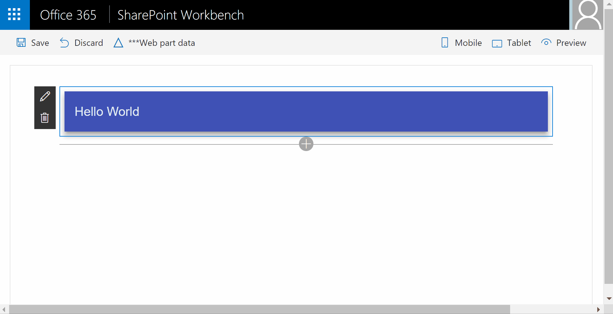
Run your webpart
Once your Web Part is ready, you can finally run it using gulp serve and see the result directly in your SharePoint
Workbench! You will benefit from awesome UIs at a very low cost!
Enjoy!
Now that you can build your webpart using Angular Material, you will be able to build nice looking experiences for the SharePoint Framework!